Tired of that feeling of dread when you stare into your closet, wondering how to piece together a decent outfit? I get it. But trust me, building stylish, cohesive looks is a skill anyone can learn. It's not about owning a mountain of clothes, but about understanding a few core ideas that make getting dressed feel less like a chore and more like a creative outlet.
Think of it less like a rigid rulebook and more like a set of helpful guidelines. The secret sauce is surprisingly simple: when you're just starting, build your outfit around a neutral foundation. Think navy, beige, grey, or white. From there, you just need to add a single pop of color. It's a nearly foolproof formula.
The Power of Neutrals and a Splash of Color
The quickest path to a sharp outfit is to lean on your neutrals. These are the workhorses of your wardrobe—colors like white, black, grey, navy, and beige—because they go with just about everything.
Once you’ve got your neutral base, like a pair of grey trousers or a classic white shirt, you can introduce a more vibrant piece. This could be anything from a rich burgundy sweater to an olive green jacket. Even a colorful accessory can do the trick.
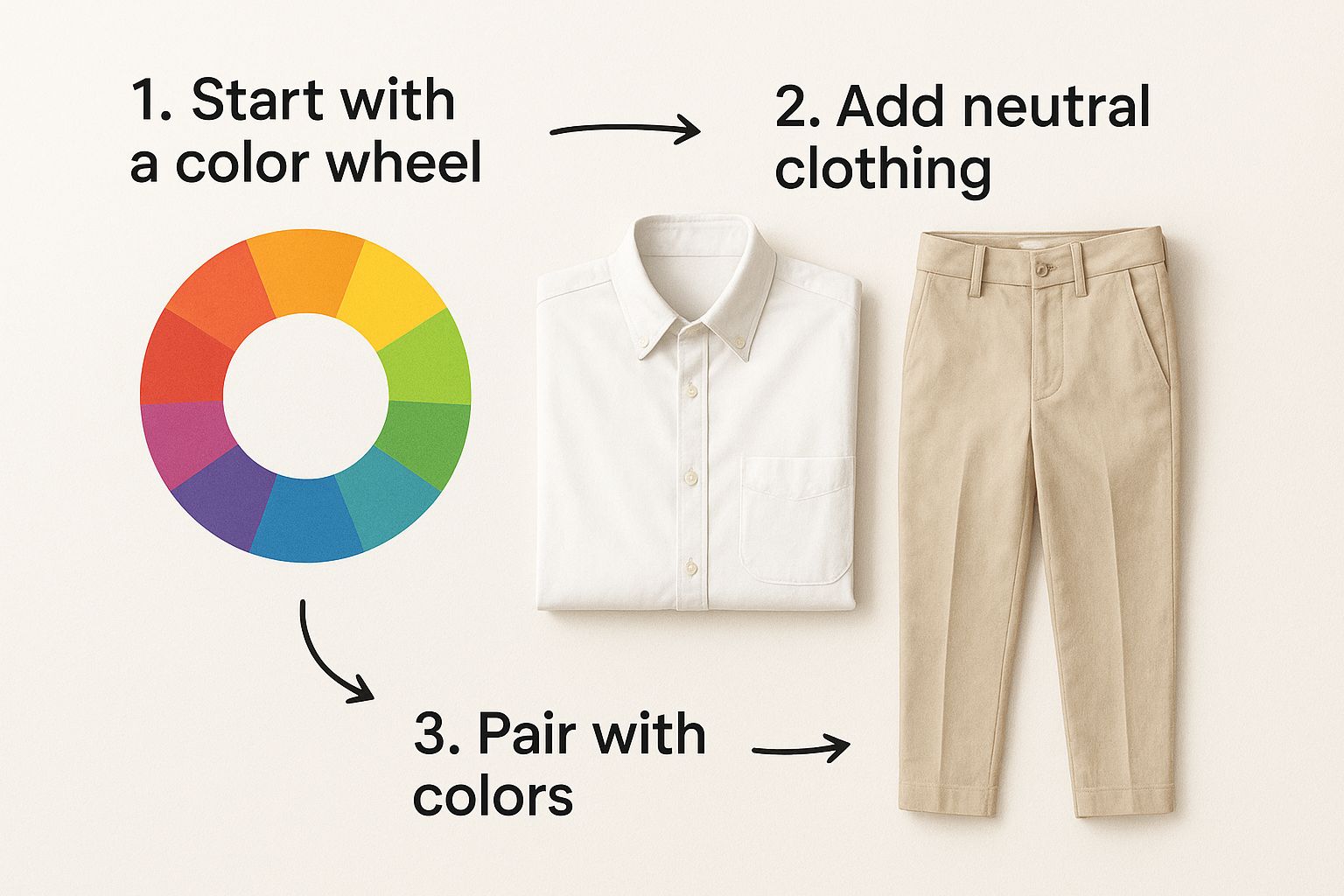
By anchoring your look with reliable neutrals, you give that single accent color the space it needs to shine without the whole outfit feeling chaotic or overwhelming.
A Few Color Wheel Cheats
To take it a step further, let’s talk about the color wheel. You don't need a degree in art theory, just a couple of easy concepts.
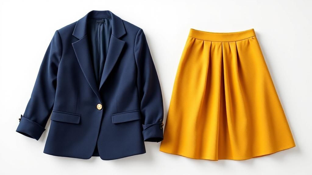
- Complementary Colors: These are colors that sit directly opposite each other on the wheel, like blue and orange. Pairing them creates a bold, high-contrast look that definitely makes a statement.
- Analogous Colors: These are neighbors on the color wheel, like green and blue. Putting them together results in a more harmonious, calming feel. It's a great way to build an outfit that looks intentionally styled and cohesive.
For a quick reference, I've put together some simple, no-fail formulas. Think of these as your cheat sheet for getting dressed in the morning.
Quick-Start Color Matching Formulas
| Formula Name | What It Is | Example Outfit |
|---|---|---|
| Neutral + Pop | A foundational outfit of neutrals (black, white, grey, navy, beige) with one strong accent color. | Grey trousers, a white t-shirt, and a vibrant emerald green blazer. |
| Monochromatic | Using different shades, tints, and tones of a single color to create a cohesive look. | Navy blue chinos paired with a lighter blue button-down shirt and a sky-blue sweater. |
| Analogous Harmony | Pairing colors that sit next to each other on the color wheel for a subtle, blended look. | An olive green jacket worn over a forest green top with dark green trousers. |
| Complementary Punch | Using two colors that are directly opposite on the color wheel for a high-impact, bold statement. | A classic navy suit paired with a burnt orange pocket square or tie. |
These formulas are just starting points, but they’re incredibly effective for building confidence and taking the guesswork out of color pairing.
Why Does This Even Matter?
Getting color coordination right is more than just a personal win—it has real-world impact. The global decorated apparel market, which is all about effective color use, was valued at a staggering USD 28.98 billion in 2023. It’s projected to shoot past USD 68.1 billion by 2030.
This huge growth shows just how much people value well-put-together aesthetics. You can dive deeper into this trend by exploring the latest decorated apparel market research.
My Personal Tip: When you're completely stumped, just go monochromatic. Dressing in different shades, tones, and tints of a single color is one of the easiest ways to look chic and intentional. Think of a navy blazer with lighter blue trousers and a pale blue shirt. It’s a classic combination that just works, every single time.
Using the Color Wheel for Your Wardrobe
Alright, let's move beyond the usual "safe" pairings and really unlock your closet's potential. The color wheel—yes, that same one from your elementary school art class—is your single best tool for mastering how to match clothes. It’s what separates random guessing from intentional, head-turning style.
At its most basic, the wheel is built from just three primary colors: red, yellow, and blue. Think of them as the foundational parents of every other color you can imagine.
When you mix any two primaries, you create the secondary colors:
- Orange (red + yellow)
- Green (blue + yellow)
- Purple (red + blue)
Go one step further by mixing a primary with a neighboring secondary, and you get the tertiary colors. These are those sophisticated, in-between shades like blue-green (think teal or turquoise) or red-orange (vermilion). Just understanding this simple family tree is the first step. You’ll start to see your wardrobe not as a pile of clothes, but as a palette of possibilities.
Creating Moods with Color Harmonies
The real magic happens when you use the wheel to build color harmonies—proven combinations that create a specific mood or effect. For everyday style, the two you absolutely need to know are complementary and analogous.
A complementary color scheme uses colors that sit directly opposite each other on the wheel. This creates the highest possible contrast, resulting in a bold, energetic, and eye-catching look. It’s perfect for those moments when you want to make a statement.
An analogous color scheme pairs colors that are right next to each other. This combo creates a low-contrast, harmonious vibe that feels serene, cohesive, and effortlessly polished. It’s your go-to for crafting outfits that look thoughtfully put-together without shouting for attention.
A great way to start is by picking one key piece—like a jacket or a pair of trousers—and then using the wheel to find its perfect partner. This simple habit can completely change how you approach getting dressed each morning.
Turning Theory into Outfits
Let's translate this into something you can actually wear. Knowing how to use these principles means you can build outfits that perfectly match your mood and the occasion.
Here’s how these schemes look in the real world:
-
Complementary Example: You've got a classic navy blue blazer. Instead of defaulting to white or grey, look directly across the color wheel. What’s opposite blue? Orange. A burnt orange or rich rust-colored sweater underneath creates a powerful, confident look that’s perfect for a creative meeting or a stylish weekend out. The contrast feels dynamic and intentional.
-
Analogous Example: Let's say you own a pair of olive green chinos. For a more subtle and sophisticated outfit, look at the colors sitting next to green—blues and yellows. Pairing those olive pants with a soft, sky-blue button-down shirt creates a calm, nature-inspired palette. The colors blend beautifully, projecting an air of quiet confidence.
By mastering these two simple concepts, you graduate from just wearing clothes to actually styling them. You're no longer just picking things that "don't clash." Instead, you're actively creating a visual story and using color to express a specific vibe. This is the fundamental skill that unlocks endless outfit combinations from the wardrobe you already own.
Building Your Personal Color Palette
Okay, let's move past matching single pieces and talk about the real game-changer: curating your signature style by building an entire color palette. This is where you graduate from just matching clothes to developing a cohesive look that feels completely, uniquely you. The secret? It all starts with building your wardrobe around the colors that naturally make you shine.
And that begins with your skin's undertones.
Discovering whether you have warm, cool, or neutral undertones is one of the most powerful style hacks I know. It’s the difference between choosing a color that makes you look radiant and one that leaves you looking a bit washed out.
Finding Your Most Flattering Shades
Here’s a quick and easy way to figure this out: the vein test. Just look at the veins on the inside of your wrist in natural daylight. It’s surprisingly accurate.
- Cool Undertones: If your veins have a blue or purple tint, you're likely in the cool camp. You'll absolutely light up in jewel tones like emerald and sapphire, deep purples, and vibrant blues.
- Warm Undertones: See more of a greenish hue? You've got warm undertones. Earthy colors are your best friends—think olive green, mustard yellow, burnt orange, and rich creams.
- Neutral Undertones: If you see a mix of blue and green, you've hit the jackpot. With neutral undertones, you can pull off almost any color with ease.
Once you know your undertone, you can start building a core palette of colors that you know will always look incredible on you. This makes shopping so much simpler and takes the guesswork out of building outfits. If you're curious, you can also explore the idea of understanding the spiritual significance of colors for another layer of inspiration.
Using The 60-30-10 Rule For Outfits
Here's a brilliant little trick borrowed from the world of interior design that works wonders for fashion: the 60-30-10 rule. It's a simple, foolproof ratio for creating outfits that feel balanced and visually interesting every single time.
The 60-30-10 Breakdown:
- 60% (Dominant Color): This is your main color, the foundation of your look. It's the big piece, like a navy suit, a camel coat, or a pair of black trousers.
- 30% (Secondary Color): This shade is there to support the main color. Think of your shirt, sweater, or blouse.
- 10% (Accent Color): This is your pop of personality. It’s the small stuff that makes a big impact—a vibrant scarf, a pocket square, a statement handbag, or your shoes.
Imagine a navy blue suit (60%), a crisp light grey shirt (30%), and a rich burgundy tie or pocket square (10%). See how it works? This formula ensures your colors work together in harmony, preventing any single element from overpowering the others. It’s a structured way to guarantee you always know how to match your clothes.
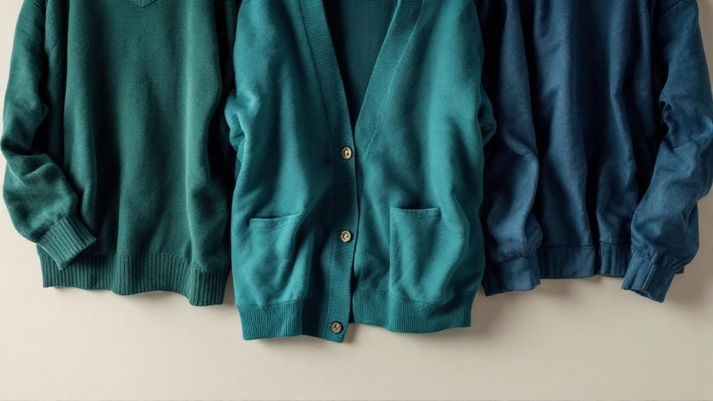
The Power of Texture in a Color Palette
Finally, let's talk about a detail that pros use to elevate their looks: texture. Texture adds depth and character, especially when you're working with a simple monochromatic or analogous color scheme. Mixing different materials in the same color family is what stops an outfit from looking flat and one-dimensional.
Picture an all-black outfit. It could be boring, right? But what if it’s a chunky black wool sweater, a pair of sleek black leather pants, and a soft suede bag? Now you have a dynamic, interesting look, all created with a single color.
The different textures catch the light in unique ways, creating subtle contrast and a rich, sophisticated vibe. This is how you take simple color pairings and turn them into truly memorable style.
Go-To Color Combinations You Can Trust
Let's be real—while knowing the ins and outs of color theory is a game-changer, sometimes you just need a handful of foolproof outfit formulas that you can grab and go. This is your cheat sheet for those reliable pairings that always look polished and put-together.
Think of these as the combinations stylists have on speed dial. They work for a reason: they’re versatile, intentional, and project a certain kind of confidence without you having to overthink it.
Timeless Classics for Any Occasion
Some color duos are classics for a reason. They're effortlessly chic and can take you from the boardroom to Sunday brunch without skipping a beat. These are the pairings that whisper sophistication.
-
Navy and White: This is the absolute peak of crisp, preppy style. A sharp navy blazer thrown over a simple white tee with your favorite jeans? It’s a perfect example of a look that feels both relaxed and incredibly pulled-together. It just screams quiet confidence.
-
Black and Camel: If you're after a dose of understated elegance, black and camel is your answer. There's a reason a beautiful camel coat over an all-black outfit has become an iconic look. This pairing feels luxurious and modern, making it a fantastic choice for professional settings or a sophisticated night out.
These two are the bedrock of a truly versatile wardrobe. They’re your safety net for those days you want to look incredible with minimal effort.
Modern Pairings for a Fresh Look
Ready to venture beyond the tried-and-true? These modern combinations feel fresh and show you've got a handle on color. They’re perfect for making a stylish statement that's still subtle.
One of my personal go-to's is olive green and blush pink. This duo strikes the perfect balance between utilitarian and feminine energy. The earthy, almost masculine vibe of olive is softened so beautifully by the delicate touch of blush pink. Try an olive utility jacket over a blush sweater with dark-wash jeans—it’s an amazing weekend look that feels both current and approachable.
Another combination I love is rich burgundy and mustard yellow. This pairing is so warm and inviting, packed with personality. A cozy burgundy knit sweater paired with mustard-colored corduroys or even just a scarf creates an incredible autumnal vibe. It's bold without being loud.
Key Takeaway: The whole point of mixing colors like this is to create visual interest. An unexpected pairing like olive and blush works because the colors complement each other's inherent vibes, creating a look that is balanced and compelling.
And remember, the right accessories are what truly complete the picture. Taking a moment to learn about things like layering and coordinating jewelry for a flawless look can elevate any of these color combinations to the next level.
To make things even easier, here’s a quick-reference table to help you nail these pairings every time.
Go-To Color Pairings and Their Vibe
| Color Combination | Style Vibe | Best For Occasion |
|---|---|---|
| Navy & White | Crisp, Preppy, Clean | Business casual, weekend brunch, seaside vacations. |
| Black & Camel | Understated, Elegant, Modern | Corporate offices, evening events, upscale casual. |
| Olive Green & Blush Pink | Soft, Balanced, Trendy | Casual outings, creative workplaces, weekend get-togethers. |
| Burgundy & Mustard | Warm, Earthy, Confident | Autumn/winter events, casual dates, artistic settings. |
Think of this table as your starting point. Once you get comfortable with these, you’ll start seeing new combinations everywhere.
How Tech Is Perfecting the Colors We Wear
That feeling when you find the perfect color? It’s not just a happy accident anymore. While we focus on mastering color matching in our own closets, the fashion industry is in the middle of its own quiet color revolution. Behind the scenes, technology is making the colors we see and buy more precise and reliable than ever, which has a huge impact on everything from our online shopping carts to the sustainability of our favorite pieces.
For years, the process for approving a garment's color was surprisingly old-school. It relied on something called "lab dips"—tiny fabric swatches that were dyed and then physically shipped back and forth between brands and their factories. This cycle of shipping, waiting, and re-dyeing created a shocking amount of waste and caused massive production delays. It was a slow, clunky system that just doesn't cut it anymore.
The Rise of Digital Color Accuracy
Today, that entire process is getting a digital makeover. The way textiles are color-matched is now being driven by tools that offer pinpoint accuracy. Brands are finally trading in their physical swatch books for sophisticated software that handles everything from virtual sampling to color management. Some even use artificial intelligence to predict exactly how a certain dye will appear on different fabrics, from cotton to silk. You can get a deeper look into the future of textile color matching on 3-tree.com.
This digital leap forward brings two huge wins for us as shoppers:
- What You See Is What You Get: The chances of that vibrant cobalt blue sweater you fell in love with online being the exact same shade when it arrives at your door have increased dramatically.
- Better Quality Control: It ensures color consistency across different production batches. That means the trousers you buy today will be a perfect match for the jacket from the same collection that you bought a month ago.
This shift means that the perfectly coordinated outfits we aim to build are supported by an industry standard that values precision. The technology guarantees that the foundational colors we rely on are dependable and true to the designer's original vision.
Designing in 3D for a Greener Wardrobe
Beyond just getting the colors right, technology is transforming how designers even create their palettes in the first place. More and more, designers are using advanced 3D design software to build entire collections virtually. This lets them play with endless color combinations and see how different shades interact on a digital avatar before a single yard of fabric is ever dyed.
Picture a designer working on a spring collection. On-screen, they can instantly swap a mint green shirt for a lilac one, pair it with dozens of different trousers, and even see how those colors shift under different lighting conditions. It’s a creative game-changer that not only speeds up the design process but also has a massive environmental upside.
By finalizing color choices digitally, brands drastically cut down on the need for physical prototypes and wasted dye. This move towards a more sustainable way of working means the beautiful, perfectly colored clothes we add to our wardrobes can be produced with a much smaller environmental footprint. It adds a whole new layer of appreciation for that perfectly hued piece, knowing it was crafted with both style and sustainability in mind.
Of course, even with a good handle on color theory, putting it into practice can bring up some tricky, real-world questions. From figuring out how to handle bold patterns to second-guessing those old-fashioned style rules we all grew up with, a few common dilemmas seem to pop up time and again.
Let's break down some of the most frequent questions I hear about matching clothing colors. My goal is to give you clear, practical answers so you can get past those moments of doubt and start building outfits with complete confidence. Time to clear up the confusion for good.
How Do I Match Prints Without Clashing?
Mixing patterns can feel like you're diving into the deep end, but there’s a surprisingly simple trick to getting it right. The secret is to look closely at your patterned piece, find a minor, less obvious color in the design, and then pull that shade out for your solid item. This creates a subtle, intentional link that looks incredibly polished.
For example, imagine you have a floral blouse with a big, bold blue background but tiny little flecks of yellow in the flowers. If you pair it with a great pair of yellow trousers, the whole look suddenly clicks. The pants pick up on that small accent color, tying everything together seamlessly.
If that feels a bit too advanced for now, just stick to this foolproof rule: pair one busy pattern with one solid, neutral piece. This lets the print be the star of the show without creating visual chaos. A vibrant printed skirt matched with a simple white t-shirt is a classic combination that, honestly, always works.
Can I Wear Black with Navy or Brown?
Absolutely. That old-school style “rule” that says you can't pair black with navy or brown is completely outdated. In fact, wearing these deep, rich neutrals together can create an exceptionally sophisticated and modern look. The key to pulling it off with confidence is all about texture.
When you mix these dark, similar colors, you need to create a clear visual separation so it doesn't look like you got dressed in the dark. Varying the materials is the best and easiest way to do this.
- Black and Navy: Think about a navy corduroy blazer paired with sleek black denim. The different textures—the distinct ribs of the corduroy against the smooth denim—clearly define each piece and make the combination feel deliberate.
- Black and Brown: Picture a rich brown leather jacket thrown over a simple black knit dress. The beautiful contrast between the supple leather and the soft, matte knit adds depth and a ton of interest.
By focusing on these textural differences, you make the combination look intentional and high-fashion, not accidental. It’s a subtle detail that signals real style confidence.
What If I'm Not Confident with Bright Colors?
You absolutely do not have to dress like a rainbow to be stylish. If you're hesitant about bringing bold colors into your wardrobe, the best way to start is small. Diving in headfirst can feel overwhelming, so think of it as a gradual process.
A great place to begin is with your accessories. A vibrant scarf, a colorful handbag, or a pair of statement shoes can add a fantastic pop of color to an otherwise neutral outfit. It’s an easy, low-risk way to experiment and see what you like without a huge commitment.
Another strategy I love is to go for more muted or pastel versions of the colors you’re drawn to. Instead of a fiery, stop-sign red, maybe try a softer dusty rose. Instead of a loud lime green, perhaps a gentle sage green feels more approachable. This allows you to explore the world of color at your own pace and in a way that feels comfortable, letting you discover what you truly love.
At Feinheit FZ LLC, we believe that exploring color is part of the joy of luxury fashion. With over 20,000 curated products from the world's best brands, you can find the perfect pieces—from foundational neutrals to stunning accent colors—to build your signature style. Discover a world of possibilities and redefine your wardrobe.