
Most advice on how to color coordinate clothes starts with the wrong goal. It tells you to match everything, as if coordination means sameness. In practice, perfect matching usually makes an outfit flatter and more predictable, while a little tension between colors looks more intentional and more expensive in the everyday world of getting dressed.
That's the useful shift. Stop chasing identical tones and start building controlled contrast, visual balance, and wardrobe infrastructure that makes decisions easier. The best outfits usually sit in the middle, not at the extremes, and that middle is where style starts to look deliberate instead of rehearsed.
Why Perfectly Matching Colors Usually Fail
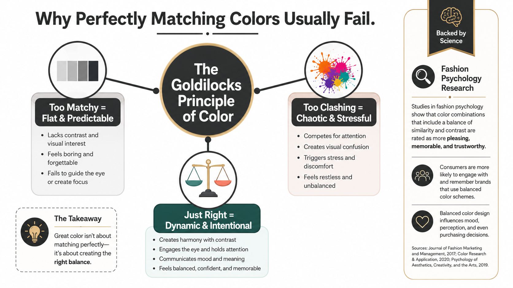
The strongest fashion psychology finding here is blunt, outfits are judged as most stylish when their colors are moderately coordinated, not perfectly matched or sharply clashing. In a PLOS ONE experiment, coordination showed a significant linear relationship with fashionableness, but the more important result was the stronger quadratic pattern, which peaked in the middle rather than at either extreme, the kind of result that gets summarized as a Goldilocks Principle for style (PLOS ONE study). The practical translation is simple, choose colors that feel related, but not identical.
Controlled contrast looks intentional
A fully matched outfit can read as rigid. A sharply clashing one can read as noisy. The middle ground works because the eye sees a relationship without boredom, and that's what people register as polished. That's also why a neutral base with one or two complementary accents usually looks sharper than a room full of identical tones.
Practical rule: if every piece looks like it came from the same dye bath, you've gone too far.
For luxury and premium dressing, this matters even more. A refined wardrobe doesn't need color drama to look expensive, it needs proportion, restraint, and a little variation in tone. When you understand that, you stop asking, “Does this match?” and start asking, “Does this relationship feel deliberate?”
The Color Wheel Mechanics That Actually Matter
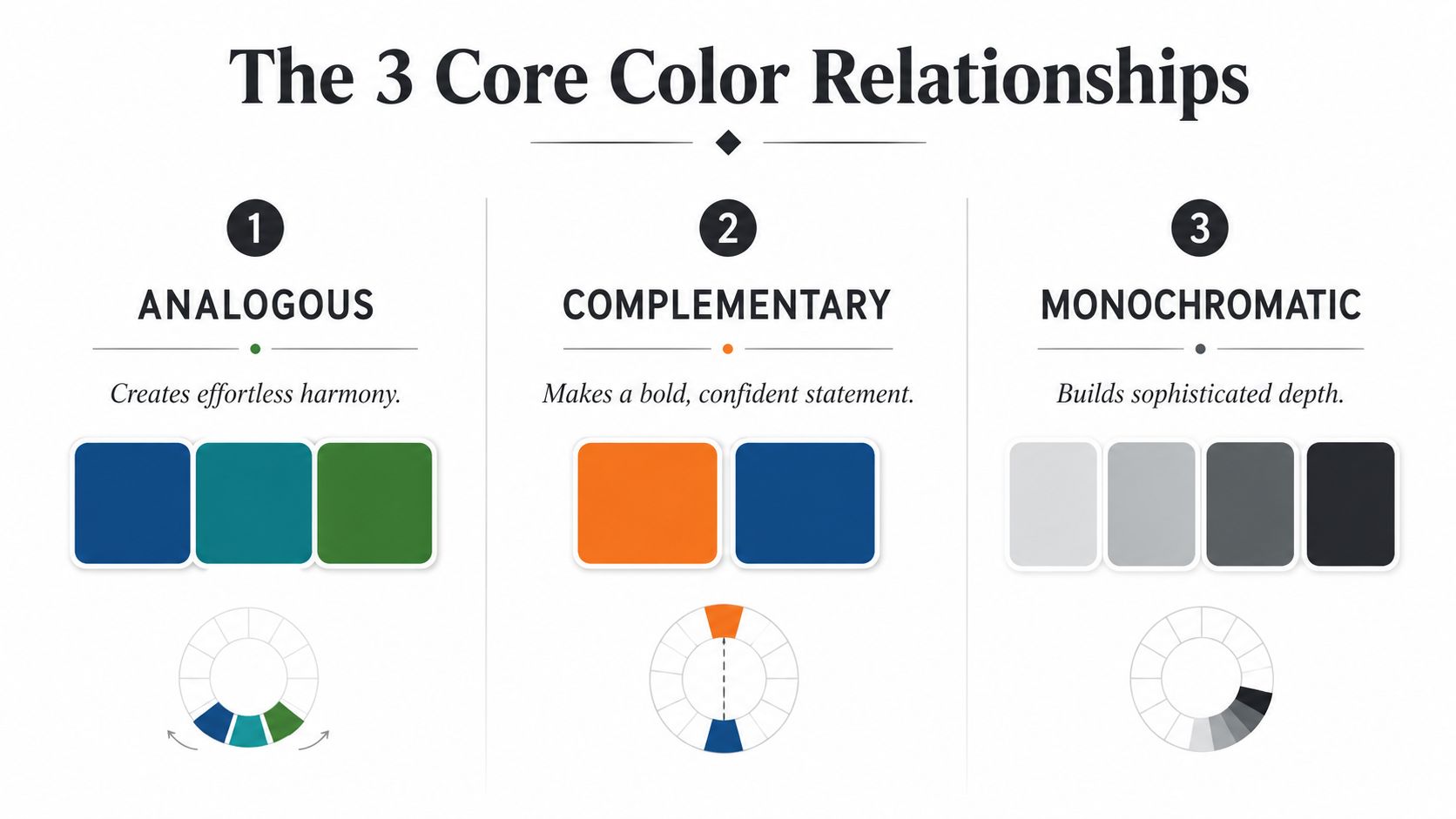
Forget the classroom version of color theory. In real dressing, you only need three relationships to make good choices fast, analogous, complementary, and monochromatic. Everything else is secondary if you know how to use those three cleanly.
Use analogous colors when you want ease
Analogous colors sit next to each other on the wheel, so they produce harmony without looking stiff. Think navy, blue, and blue-green, or beige, camel, and warm brown. A simple example is a navy sweater with mid-blue jeans and a pale blue shirt, it feels cohesive without becoming a uniform.
Use complementary colors when you want tension
Complementary colors sit opposite each other and create a stronger contrast. Blue and orange is the classic pair, but in clothes you can translate that into navy with rust, charcoal with burgundy, or olive with oxblood. The point isn't to look loud, it's to let one color energize the other.
Use monochromatic when you want depth
A monochromatic outfit uses different shades of one color, so it builds richness without adding complexity. Charcoal trousers, a mid-gray knit, and a light gray coat is monochromatic. Black and white together is not monochromatic, because that scheme is about related shades of the same color, not two neutrals forced into the same sentence. For deeper color guidance, fashion color theory from Arrisco is a useful reference point.
The best stylists don't ask clients to memorize a wheel. They ask a cleaner question. Which relationship are you building today, harmony, contrast, or depth?
Applying the 60-30-10 Rule to Real Outfits
The 60-30-10 rule works because it gives every color a job. The dominant color carries most of the visual weight, the secondary color supports the silhouette, and the accent color delivers personality. That's far more useful than trying to make every piece speak at once.
Workday look
Start with navy as the 60 percent base, then bring in camel as the 30 percent support, and finish with burgundy as the 10 percent accent. A navy suit or blazer, camel knit, and burgundy pocket square or tie reads composed without looking overdone. Navy grounds the look, camel softens it, and burgundy gives it pulse.
Weekend look
Use cream as the dominant color, olive as the secondary, and cognac as the accent. That could mean cream jeans or trousers, an olive overshirt, and cognac loafers or a belt. The palette feels relaxed because the warm tones stay in the same lane, and the darker accessory stops the outfit from looking washed out.
Evening look
Go with charcoal as the base, ivory as the support, and a single accent like emerald or oxblood. A charcoal jacket, ivory shirt, and emerald knit tie or oxblood velvet slipper gives you enough contrast to look intentional, but not theatrical. The 60-30-10 structure earns its keep, because the accent has room to matter.
Rule to keep in mind: one accent is a decision. Three accents are usually a negotiation.
The main failure modes are predictable. Too many competing accents kill the hierarchy, mixed warm and cool tones in the same look make the outfit feel unresolved, and uneven saturation makes one piece shout while the others whisper. Keep the structure stable, and the outfit stops fighting itself.
Building a Neutral-First Wardrobe
A wardrobe works best when it behaves like infrastructure. Neutrals do the heavy lifting, accents do the talking, and trend colors stay in the smallest share of the closet. A widely used wardrobe guideline puts that at 60–70% neutrals, 20–30% accent colors, and 5–10% seasonal trend colors (wardrobe color statistics guide). Treat that as a practical distribution, not a moral rule.
Why neutrals win in daily life
Black, white, navy, gray, and beige combine with a larger share of other garments, so they multiply outfit options instead of narrowing them. That's why a neutral foundation reduces morning friction. You don't have to negotiate every shirt with every trouser when the base palette is already cooperative.
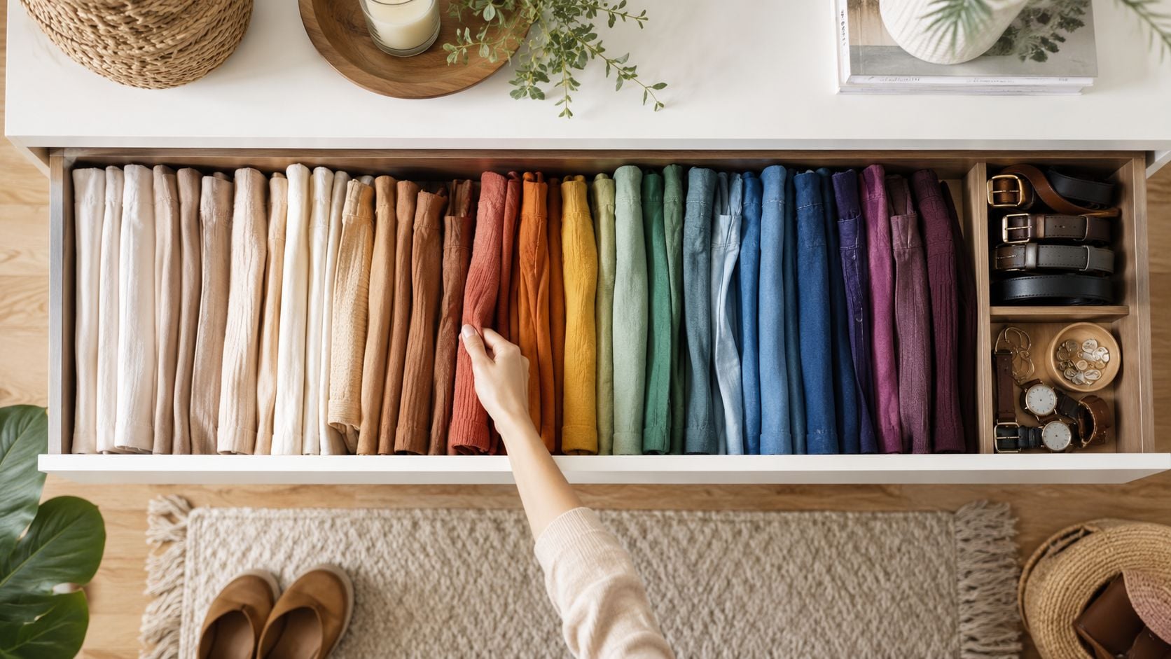
A second benefit is visual order. If you sort clothes by category first, then by color, and then use either a light-to-dark gradient or ROYGBIV sequence, you can see pairings faster. Wardrobe guidance also recommends assigning multi-colored items to their dominant hue and keeping prints in a separate section (closet organization guidance).
Build the closet like a system
If you want clothes that work together, think in layers.
- Neutrals first: black, white, navy, gray, and beige form the base.
- Accents second: choose a smaller set of colors that you wear.
- Trend pieces last: keep those as the smallest, most selective layer.
That structure doesn't feel restrictive. It makes getting dressed easier because the closet itself already answers half the question. You're not searching for inspiration every morning, you're choosing from a system that's already biased toward coordination.
Handling Prints, Patterns, and Tricky Pieces
The test of color coordination starts when the wardrobe stops being polite. Prints, multi-tone knits, textured tailoring, and statement pieces force you to make decisions instead of leaning on simple solids. The cleanest way to handle them is to extract one dominant hue from the loudest item and build the rest of the outfit around that color.
One dominant hue, then discipline
A client with a patterned silk shirt doesn't need a rainbow around it. She needs the print's main color echoed once or twice, then quiet supporting pieces. If the shirt carries navy, ivory, and a touch of gold, I'd keep the trouser navy or ivory and let the metallic details stay restrained. That keeps the look coherent without flattening the print.
Two prints can work together, but only if they share a color family and differ in scale. A small stripe with a larger floral, both in the same navy and cream story, is manageable. Two loud prints with competing temperatures usually aren't.
Treat metallics as neutral
Gold, silver, and similar metallic finishes often work better as neutral hardware than as true accents. Use them in a belt buckle, shoe detail, bag hardware, or jewelry, and let them support the outfit instead of competing with it. That's especially useful when you're working with textured tailoring or statement outerwear, because the metal adds finish without adding another color voice.
For shoppers who want a place to start, Feinheit FZ LLC publishes color-coordination guidance and a 60-30-10 breakdown for outfit building, which fits neatly into this function-first approach. The point is not to buy more color. It's to make the colors you already own work harder.
Don't force every expressive piece to be the hero. Sometimes the smartest move is to let one item carry the whole outfit and keep everything else quiet.
Matching Colors to Skin Tone and Lighting
Color coordination doesn't happen on a hanger. It happens near your face, under your lighting, and in the context of how your skin reads in the world. That's why undertone matters. If a color brightens your face, it works. If it drains you, it doesn't, no matter how pretty it looks on the rack.
Start with undertone, not fantasy
The easiest at-home read is straightforward. Cool undertones usually lean better in silver and blue-based colors, warm undertones tend to work better with gold and earth tones, and neutral undertones can sit between both. Vein checks, jewelry preference, and how your skin reacts in the sun are practical clues, but the true test is still the mirror near your face.
Lighting changes the result. Natural daylight shows color most accurately, office fluorescents can push tones cooler, and warm indoor bulbs can make some colors look richer while flattening others. Camera flash is the least forgiving of all, which matters if you shop online and rely on product photos before you try anything on.
Use the face test
Don't ask whether a color is “nice.” Ask whether it gives your face clarity. Two or three colors near the face usually outperform a maximalist palette, especially when one of them is a neutral anchor. That's the point of the neutral-first approach, it creates room for the right accent without overwhelming your skin.
A simple decision tree works at home.
- Looks good in daylight, but tired indoors: keep the color if you mostly wear it outside.
- Brightens the face in every light: keep it as a strategic piece.
- Fights with your skin in most settings: remove it from your core rotation.
The aim isn't to find one universal answer. It's to choose colors that hold up across offices, dinners, travel, and photos without making you work for them.
Your Practical Color Coordination Checklist
Before you get dressed, decide the outfit's relationship first. Choose analogous, complementary, or monochromatic, then assign the colors to the 60-30-10 structure so each piece has a role. After that, check temperature consistency, because warm and cool pieces in the same look can unravel cohesion fast.
Use this short filter.
- Pick the base: choose the dominant color that will carry most of the visual weight.
- Add the support: select one secondary color that grounds the silhouette.
- Check the accent: keep it to one deliberate point of interest, not a cluster of competing details.
- Test the face zone: make sure the colors near your face sharpen, not dull, your appearance.
- Confirm the wardrobe logic: if the piece won't work with several existing items, it doesn't belong in the core rotation.
That's the answer to how to color coordinate clothes with confidence. Not matching for its own sake, but building outfits that multiply your options, hold their shape visually, and make getting dressed less chaotic.
At theFeinheit, luxury is about finding pieces that multiply your options, not consume your budget. One strategic investment beats five impulse purchases. Explore our collection of over 13,000 products from 160+ leading brands to build wardrobe infrastructure that endures. Discover your power at theFeinheit.
Feinheit FZ LLC helps you choose pieces that fit a coherent wardrobe, not just a single outfit. If you want clothing, shoes, bags, and accessories that support cleaner color coordination and stronger day-to-day dressing, visit Feinheit FZ LLC and build from a smarter foundation.